BREATH
The concept behind the work was to treat the logo as a system instead of an artefact, constructing the monogram from one repeating oval unit that stacks into letterforms and can be rebuilt at any scale.
Visual Identity
Breath
Jun 21, 2026

A logo built as a system, not a file
Overview
BREATH was created as a brand identity built on a single modular idea rather than a fixed mark. The concept behind the work was to treat the logo as a system instead of an artefact, constructing the monogram from one repeating oval unit that stacks into letterforms and can be rebuilt at any scale. By documenting the geometry as a coordinate system rather than a static file, BREATH becomes an identity that keeps its internal logic wherever it is applied, in a way that feels engineered and organic at once.
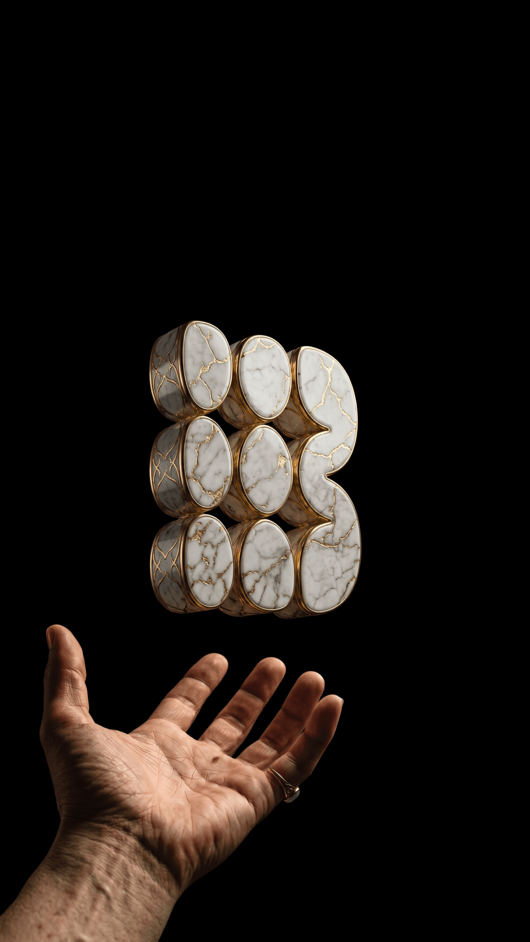
The visual language of the brand focuses on material and weight. The monogram is rendered in stone, oxidised copper and gold-veined marble, then filmed in the hand against black, giving a digital mark the presence of a cast object. A single coral accent and stark typographic specimens keep the system sharp where the materials are soft. The result is an identity that feels sculptural yet systematic, allowing the mark itself to remain the primary focus.





Explore more.

